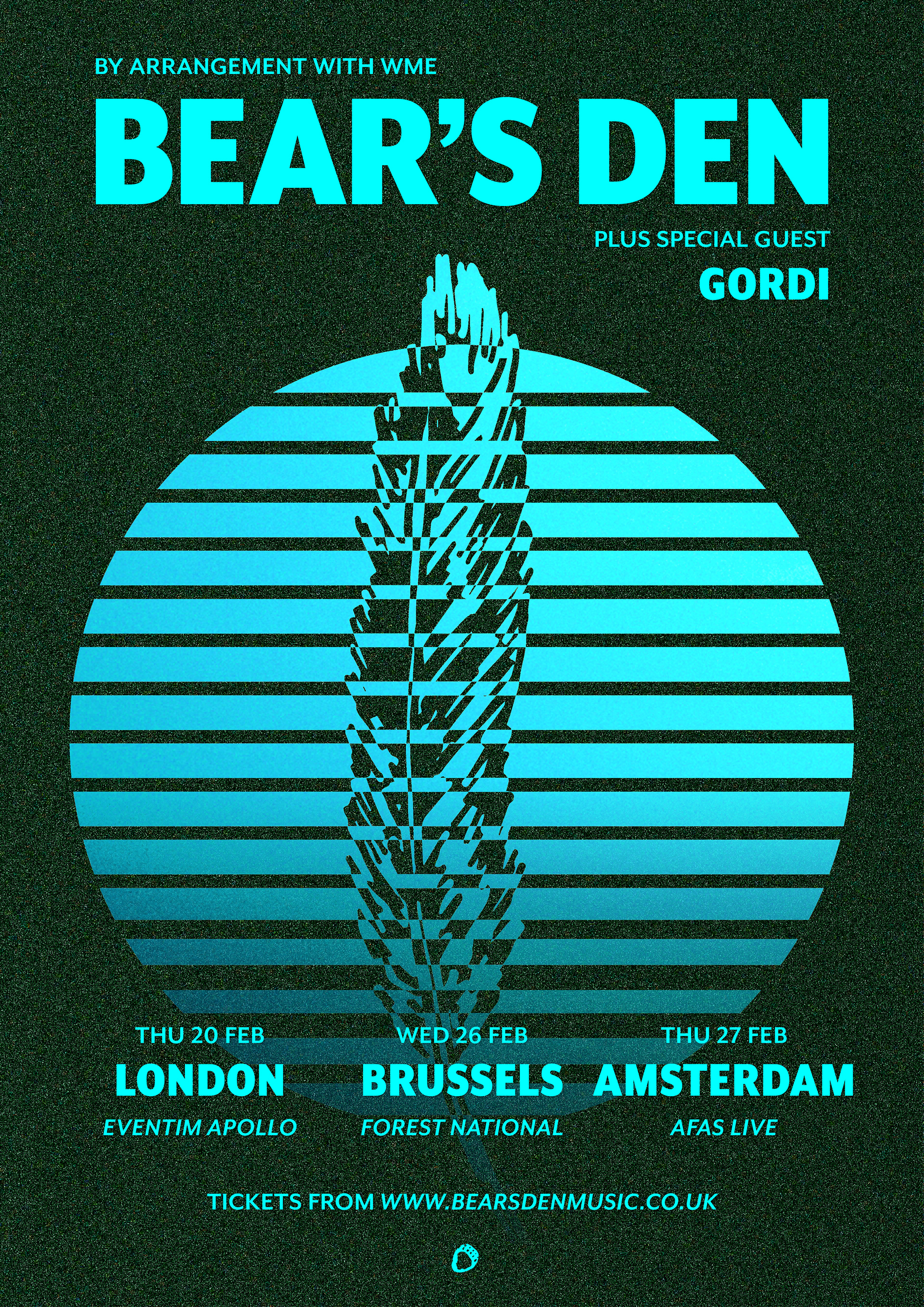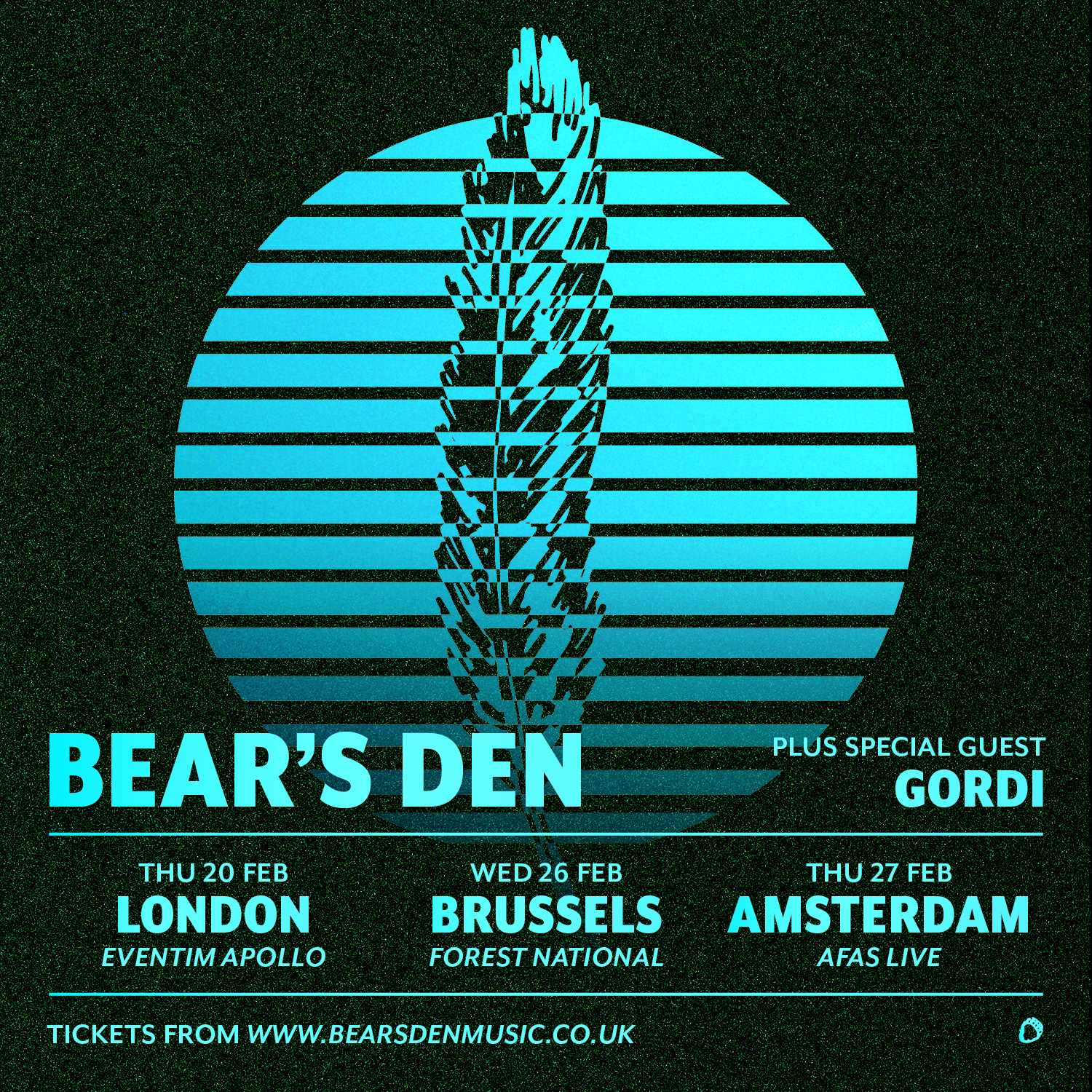
Some elements had to be continued, their existing campaign had featured the feather illustration and they were keen to continue this.
The design had to be in line with the existing album artwork, but with a fresh feel and colour palette. Using a neon cyan tone on a contrasting dark green background with digital noise gave the identity a sense of tactility. Replacing the lighter monospace font by a bold sans-serif supports this contemporary look.